Note Display - HTML5 SVG Fill Animation with CSS3 and Vanilla JavaScript
This article will teach you how to build the animated note display from Awwwads website. It discusses HTML5 SVG circle element, its stroke properties and how to animate them with CSS variables and Vanilla JavaScript.
- 🕹 Demo: Note Display Project
- 📂 Repo: Note Display Repo
File Structure
Let’s start creating the files in the terminal:
🌹  mkdir note-display
🌹  cd note-display
🌹  touch index.html styles.css scripts.js
HTML
The initial template linking both css and js files.
<!-- index.html -->

<!DOCTYPE html>
<html lang="en">
<head>
  <meta charset="UTF-8">

  <title>Note Display</title>

  <link rel="stylesheet" href="./styles.css">
</head>
<body>
  <script src="./scripts.js"></script>
</body>
</html>
Each note element consists of a list-item, li that holds the circle, the note value and its label.
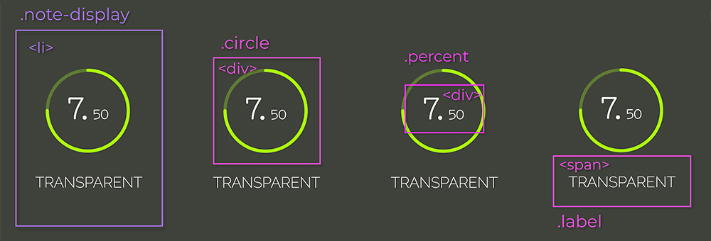
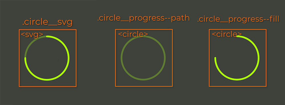
The .circle_svg is an svg element, that wraps two <circle> elements. The first is the path to be filled and the second, the fill that will be animated.
The note is separated into integer and decimals so different font-sizes can be applied to them. The label is a simple <span>. Putting all of this together:
<li class="note-display">
  <div class="circle">
    <svg width="84" height="84" class="circle__svg">
      <circle cx="41" cy="41" r="38" class="circle__progress circle__progress--path"></circle>
      <circle cx="41" cy="41" r="38" class="circle__progress circle__progress--fill"></circle>
    </svg>

    <div class="percent">
      <span class="percent__int">0.</span>
      <span class="percent__dec">00</span>
    </div>
  </div>

  <span class="label">Transparent</span>
</li>
The cx and cy attributes define the circle’s x-axis and y-axis center point. The r attribute defines its radius.
You have probably noticed the underscore/dash pattern in classes names. That’s BEM, which stands for block, element, modifier. It is a methodology that makes your element naming more structured, organized and semantic. Take a look on how it works: BEM Documentation.
To finish the template structure,s let’s wrap the four list-items in an unordered-list element:
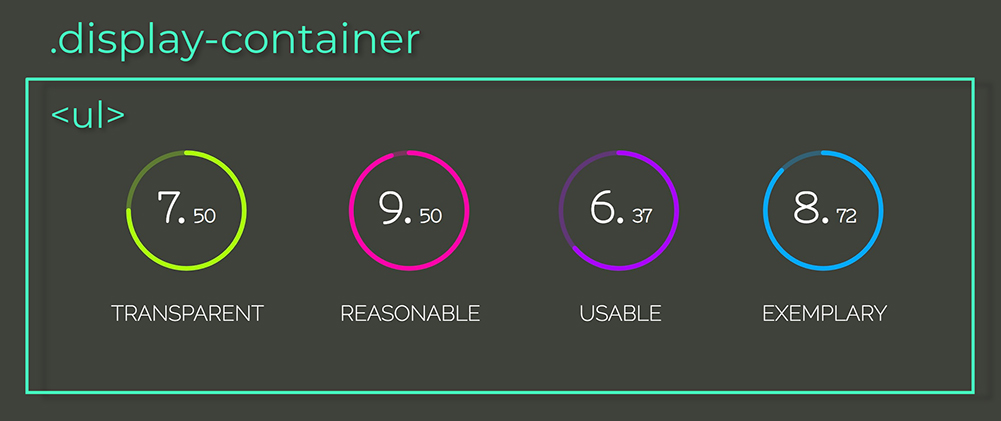
<ul class="display-container">
  <li class="note-display">
    <div class="circle">
      <svg width="84" height="84" class="circle__svg">
        <circle cx="41" cy="41" r="38" class="circle__progress circle__progress--path"></circle>
        <circle cx="41" cy="41" r="38" class="circle__progress circle__progress--fill"></circle>
      </svg>

      <div class="percent">
        <span class="percent__int">0.</span>
        <span class="percent__dec">00</span>
      </div>
    </div>

    <span class="label">Transparent</span>
  </li>

  <li class="note-display">
    <div class="circle">
      <svg width="84" height="84" class="circle__svg">
        <circle cx="41" cy="41" r="38" class="circle__progress circle__progress--path"></circle>
        <circle cx="41" cy="41" r="38" class="circle__progress circle__progress--fill"></circle>
      </svg>

      <div class="percent">
        <span class="percent__int">0.</span>
        <span class="percent__dec">00</span>
      </div>
    </div>

    <span class="label">Reasonable</span>
  </li>

  <li class="note-display">
    <div class="circle">
      <svg width="84" height="84" class="circle__svg">
        <circle cx="41" cy="41" r="38" class="circle__progress circle__progress--path"></circle>
        <circle cx="41" cy="41" r="38" class="circle__progress circle__progress--fill"></circle>
      </svg>

      <div class="percent">
        <span class="percent__int">0.</span>
        <span class="percent__dec">00</span>
      </div>
    </div>

    <span class="label">Usable</span>
  </li>

  <li class="note-display">
    <div class="circle">
      <svg width="84" height="84" class="circle__svg">
        <circle cx="41" cy="41" r="38" class="circle__progress circle__progress--path"></circle>
        <circle cx="41" cy="41" r="38" class="circle__progress circle__progress--fill"></circle>
      </svg>

      <div class="percent">
        <span class="percent__int">0.</span>
        <span class="percent__dec">00</span>
      </div>
    </div>

    <span class="label">Exemplary</span>
  </li>
</ul>
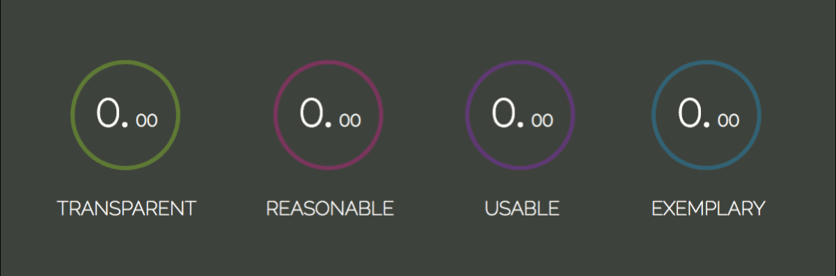
You must be asking yourself what the labels: Transparent, Reasonable, Usable and Exemplary mean. The more acquainted you get with programming, you will realize that writing code is not only about making the application functional, but also assuring that it will be long term maintainable and scalable. And that is only achieved if your code is easy to change.
The acronym
TRUEshould help decide if the code you write will be able to accommodate change in the future or not.
So next time ask yourself:
- Transparent: are code changes consequences clear?
- Reasonable: is cost benefit worth it?
- Usable: will I be able to reuse it in unexpected scenarios?
- Exemplary: does it present high quality as an example for future code?
Sandi Metz book Practical Object Oriented Design in Ruby explains TRUE and other principles and how to achieve those through design patterns. If you haven’t taken some time to study design patterns yet, consider having this book as bedtime reading.
CSS
Let’s import the fonts and apply a reset to all items:
@import url('https://fonts.googleapis.com/css?family=Nixie+One|Raleway:200');

* {
  padding: 0;
  margin: 0;
  box-sizing: border-box;
}
The box-sizing: border-box property includes padding and border values into element’s total width and height, so it’s easier to calculate its dimensions. For a visual explanation on box-sizing please visit: Make your life easier with CSS Box Sizing.
body {
  height: 100vh;
  color: #fff;
  display: flex;
  background: #3E423A;
  font-family: 'Nixie One', cursive;
}

.display-container {
  margin: auto;
  display: flex;
}
By combining the rules display: flex in the body and margin-auto in the .display-container, it’s possible to center the child element both vertically and horizontally. And the .display-container element will also be a flex-container, that way its children will be placed in the same row, along the main-axis.
The .note-display list-item will also be a flex-container. Since there are many children for centering, let’s do it through justify-content and align-items properties. All flex-items will be centered along cross and main axis. If you don’t know what cross and main axis are, check out the alignment section at: CSS Flexbox Fundamentals Visual Guide.
.note-display {
  display: flex;
  flex-direction: column;
  align-items: center;
  margin: 0 25px;
}
Let’s apply a stroke to the circles by setting the rules: stroke-width, stroke-opacity and stroke-linecap, which styles the stroke live ends. Next, will add a color to each circle:
.circle__progress {
fill: none;
stroke-width: 3;
stroke-opacity: 0.3;
stroke-linecap: round;
}
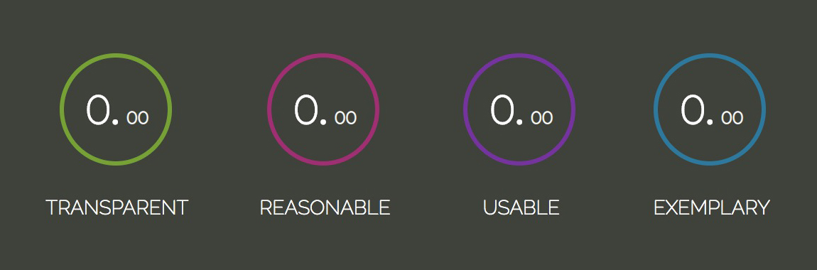
.note-display:nth-child(1) .circle__progress { stroke: #AAFF00; }
.note-display:nth-child(2) .circle__progress { stroke: #FF00AA; }
.note-display:nth-child(3) .circle__progress { stroke: #AA00FF; }
.note-display:nth-child(4) .circle__progress { stroke: #00AAFF; }
In order to position the percent element absolutely, it’s necessary to know absolutely to what. The .circle element should be the reference, so let’s add position: relative to it. For a deeper, visual explanation on absolute positioning please visit: How to understand CSS Position Absolute once and for all
Another way of centering elements is to combine top: 50%, left: 50% and transform: translate(-50%, -50%);, which position the element’s center at its parent’s center.
.circle {
  position: relative;
}

.percent {
  width: 100%;
  top: 50%;
  left: 50%;
  position: absolute;
  font-weight: bold;
  text-align: center;
  line-height: 28px;
  transform: translate(-50%, -50%);
}

.percent__int { font-size: 28px; }
.percent__dec { font-size: 12px; }

.label {
  font-family: 'Raleway', serif;
  font-size: 14px;
  text-transform: uppercase;
  margin-top: 15px;
}
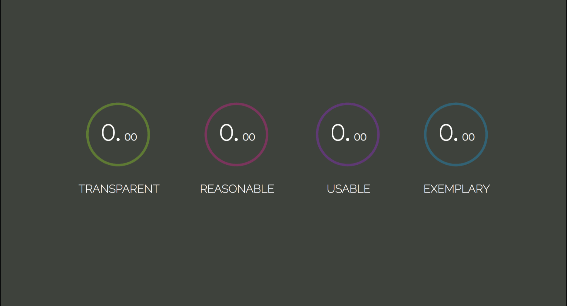
By now, the template should be looking like this:
Fill Transition
The circle animation will be done through two circle svg properties: stroke-dasharray and stroke-dashoffset.
stroke-dasharraydefines the dash-gap pattern in a stroke.
It can take up to four values:
- when it’s set to an only integer,
stroke-dasharray: 10, dashes and gaps have the same size - for two values:
stroke-dasharray: 10 5the first is applied to dashes, second to gaps - the third and forth forms:
stroke-dasharray: 10 5 2andstroke-dasharray: 10 5 2 3will generate dashes and gaps in various sizes.
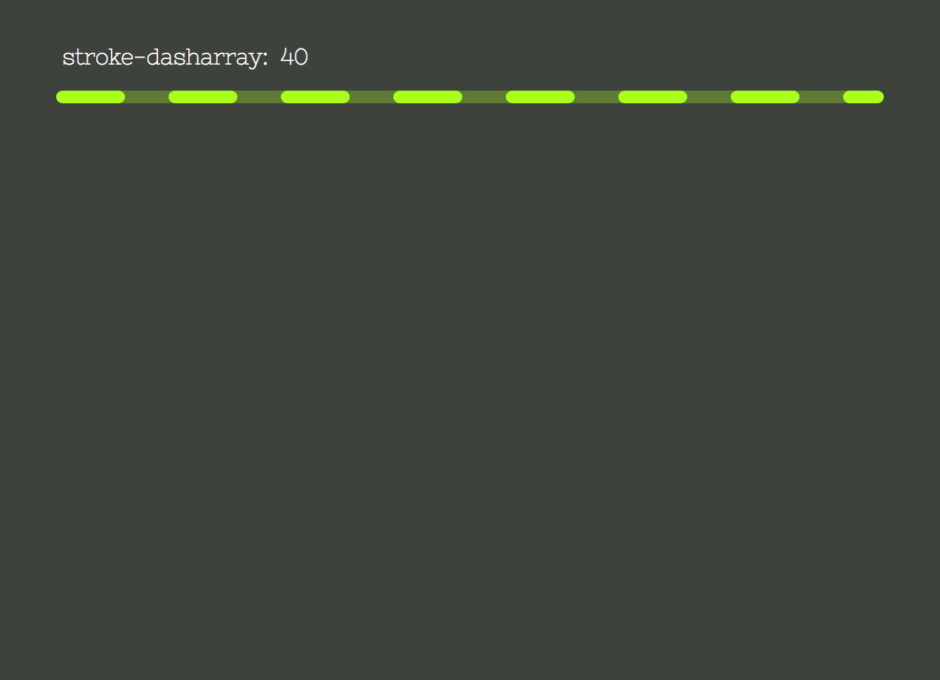
The image to the left shows the property stroke-dasharray being set from 0 to 238px, which is the circle circumference length.
The second image represents the stroke-dashoffset property, that offsets the beginning of the dash array. It is also set from 0 to the circle circumference length.
To produce the filling effect we will set the stroke-dasharray to the circumference length. So all of its length gets filled with a big dash and no gap. And offset it by the same value, so it gets “hidden”. Then the stroke-dashoffset will be updated to the corresponding note value, filling the stroke accordingly to the transition duration.
The properties updating will be done in the scripts through CSS Variables. Let’s declare the variables and set the properties:
.circle__progress--fill {
  --initialStroke: 0;
  --transitionDuration: 0;
  stroke-opacity: 1;
  stroke-dasharray: var(--initialStroke);
  stroke-dashoffset: var(--initialStroke);
  transition: stroke-dashoffset var(--transitionDuration) ease;
}
In order to set the initial value and update the variables, let’s start by selecting all .note-display elements with document.querySelectorAll. The transitionDuration will be set to 900 milliseconds.
Then, we iterate through the displays array, select its .circle__progress.circle__progress--fill and extract the r attribute set in the HTML to calculate the circumference length. With that, we can set the initial --dasharray and --dashoffset values.
The animation will occur when the --dashoffset variable gets updated by a 100ms setTimeout:
const displays = document.querySelectorAll('.note-display');
const transitionDuration = 900;

displays.forEach(display => {
  let progress = display.querySelector('.circle__progress--fill');
  let radius = progress.r.baseVal.value;
  let circumference = 2 * Math.PI * radius;

  progress.style.setProperty('--transitionDuration', `${transitionDuration}ms`);
  progress.style.setProperty('--initialStroke', circumference);

  setTimeout(() => progress.style.strokeDashoffset = 50, 100);
});
To get the transition starting from the top, the .circle__svg element has to be rotated:
.circle__svg {
  transform: rotate(-90deg);
}

Now, let’s calculate the dashoffset value, relative to the note. The note value will be inserted to each liitem through the data-* attribute. The * can be switched for any name that suits your needs and it can then, be retrieved in js through the element’s dataset: element.dataset.*. Read more about data attribute on MDN Web Docs - data-*Our attribute will be called data-note:
<ul class="display-container">
+ <li class="note-display" data-note="7.50">
<div class="circle">
<svg width="84" height="84" class="circle__svg">
<circle cx="41" cy="41" r="38" class="circle__progress circle__progress--path"></circle>
<circle cx="41" cy="41" r="38" class="circle__progress circle__progress--fill"></circle>
</svg>
<div class="percent">
<span class="percent__int">0.</span>
<span class="percent__dec">00</span>
</div>
</div>
<span class="label">Transparent</span>
</li>
+ <li class="note-display" data-note="9.27">
<div class="circle">
<svg width="84" height="84" class="circle__svg">
<circle cx="41" cy="41" r="38" class="circle__progress circle__progress--path"></circle>
<circle cx="41" cy="41" r="38" class="circle__progress circle__progress--fill"></circle>
</svg>
<div class="percent">
<span class="percent__int">0.</span>
<span class="percent__dec">00</span>
</div>
</div>
<span class="label">Reasonable</span>
</li>
+ <li class="note-display" data-note="6.93">
<div class="circle">
<svg width="84" height="84" class="circle__svg">
<circle cx="41" cy="41" r="38" class="circle__progress circle__progress--path"></circle>
<circle cx="41" cy="41" r="38" class="circle__progress circle__progress--fill"></circle>
</svg>
<div class="percent">
<span class="percent__int">0.</span>
<span class="percent__dec">00</span>
</div>
</div>
<span class="label">Usable</span>
</li>
+ <li class="note-display" data-note="8.72">
<div class="circle">
<svg width="84" height="84" class="circle__svg">
<circle cx="41" cy="41" r="38" class="circle__progress circle__progress--path"></circle>
<circle cx="41" cy="41" r="38" class="circle__progress circle__progress--fill"></circle>
</svg>
<div class="percent">
<span class="percent__int">0.</span>
<span class="percent__dec">00</span>
</div>
</div>
<span class="label">Exemplary</span>
</li>
</ul>
The parseFloat method will convert the string returned by display.dataset.note into a floating point number. The offset represents the percentage missing to reach the maximum score. So, for a 7.50 note, we would have (10 - 7.50) / 10 = 0.25, which means the circunference length should be offset by 25% of its value:
let note = parseFloat(display.dataset.note);
let offset = circumference * (10 - note) / 10;
Updating the scripts.js:
const displays = document.querySelectorAll('.note-display');
const transitionDuration = 900;

displays.forEach(display => {
  let progress = display.querySelector('.circle__progress--fill');
  let radius = progress.r.baseVal.value;
  let circumference = 2 * Math.PI * radius;
+ let note = parseFloat(display.dataset.note);
+ let offset = circumference * (10 - note) / 10;

  progress.style.setProperty('--initialStroke', circumference);
  progress.style.setProperty('--transitionDuration', `${transitionDuration}ms`);

+ setTimeout(() => progress.style.strokeDashoffset = offset, 100);
});

Before we move on, let’s extract the stoke transition to its own method:
const displays = document.querySelectorAll('.note-display');
const transitionDuration = 900;

displays.forEach(display => {
- let progress = display.querySelector('.circle__progress--fill');
- let radius = progress.r.baseVal.value;
- let circumference = 2 * Math.PI * radius;
  let note = parseFloat(display.dataset.note);
- let offset = circumference * (10 - note) / 10;

- progress.style.setProperty('--initialStroke', circumference);
- progress.style.setProperty('--transitionDuration', `${transitionDuration}ms`);

- setTimeout(() => progress.style.strokeDashoffset = offset, 100);

+ strokeTransition(display, note);
});

+ function strokeTransition(display, note) {
+   let progress = display.querySelector('.circle__progress--fill');
+   let radius = progress.r.baseVal.value;
+   let circumference = 2 * Math.PI * radius;
+   let offset = circumference * (10 - note) / 10;

+   progress.style.setProperty('--initialStroke', circumference);
+   progress.style.setProperty('--transitionDuration', `${transitionDuration}ms`);

+   setTimeout(() => progress.style.strokeDashoffset = offset, 100);
+ }
Note Value Increase
There is still the note transition from 0.00 to the note value to be built. The first thing to do is to separate the integer and decimal values. We will use the string method split(), it takes an argument that determines where the string will be broken and returns an array containing both broken strings. Those will be converted to numbers and passed as arguments to the increaseNumber() function, along with the display element and a flag indicating if its an integer or a decimal.
const displays = document.querySelectorAll('.note-display');
const transitionDuration = 900;

displays.forEach(display => {
  let note = parseFloat(display.dataset.note);
+ let [int, dec] = display.dataset.note.split('.');
+ [int, dec] = [Number(int), Number(dec)];

  strokeTransition(display, note);

+ increaseNumber(display, int, 'int');
+ increaseNumber(display, dec, 'dec');
});
In the increaseNumber() function, we select either the .percent__int or .percent__dec element, depending on the className, and also if the output will contain a decimal point or not. We’ve set our transitionDuration to 900ms, to animate a number from 0 to 7 for example, the duration has to be divided by the note: 900 / 7 = 128.57ms, the result represents how long each increase iteration will take. That means our setInterval will fire every 128.57ms.
With those variables set, let’s define the setInterval. The counter variable will be appended to the element as text and increased on each iteration:
function increaseNumber(display, number, className) {
  let element = display.querySelector(`.percent__${className}`),
      decPoint = className === 'int' ? '.' : '',
      interval = transitionDuration / number,
      counter = 0;

  let increaseInterval = setInterval(() => {
    element.textContent = counter + decPoint;
    counter++;
  }, interval);
}
Cool! It does increase the values, but it kind of does it forever. We need to clear the setInterval when the notes achieve the value we want. That is done with clearInterval function:
function increaseNumber(display, number, className) {
  let element = display.querySelector(`.percent__${className}`),
      decPoint = className === 'int' ? '.' : '',
      interval = transitionDuration / number,
      counter = 0;

  let increaseInterval = setInterval(() => {
+   if (counter === number) { window.clearInterval(increaseInterval); }

    element.textContent = counter + decPoint;
    counter++;
  }, interval);
}

Now the number is updated up to the note value and cleared with clearInterval() function.
That’s pretty much it for this tutorial, I hope you have enjoyed it! If you feel like building something a bit more interactive, check out this Memory Game Tutorial in Vanilla JavaScript, it covers basic HTML5, CSS3 and JavaScript concepts such as: positioning, perspective, transitions, flexbox, event handling, timeouts and ternaries.
Happy coding! 🌹
References
- Awwwads
- Marina Ferreira - CSS Flexbox Fundamentals Visual Guide
- Marina Ferreira - Make your life easier with CSS Box Sizing
- Marina Ferreira - How to understand CSS Position Absolute once and for all
- BEM Documentation
- Sandi Metz - Practical Object Oriented Design in Ruby
- MDN Web Docs - SVG
- MDN Web Docs - Circle
- MDN Web Docs - Box Sizing
- MDN Web Docs - Stroke Dash Array
- MDN Web Docs - Stroke Dash Offset
- MDN Web Docs - CSS Variables
- MDN Web Docs - Query Selector All
- MDN Web Docs - data-*
- MDN Web Docs - Parse Float
- MDN Web Docs - Split
- MDN Web Docs - Set Interval
- MDN Web Docs - Clear Interval


